
Work: Case Study
The American
Chestnut Foundation
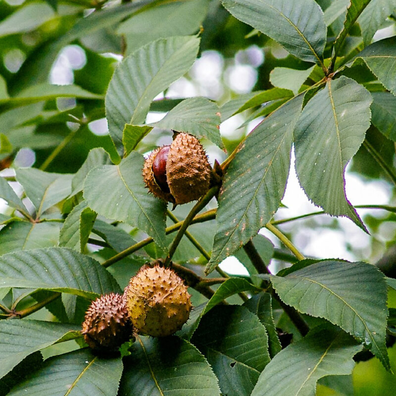
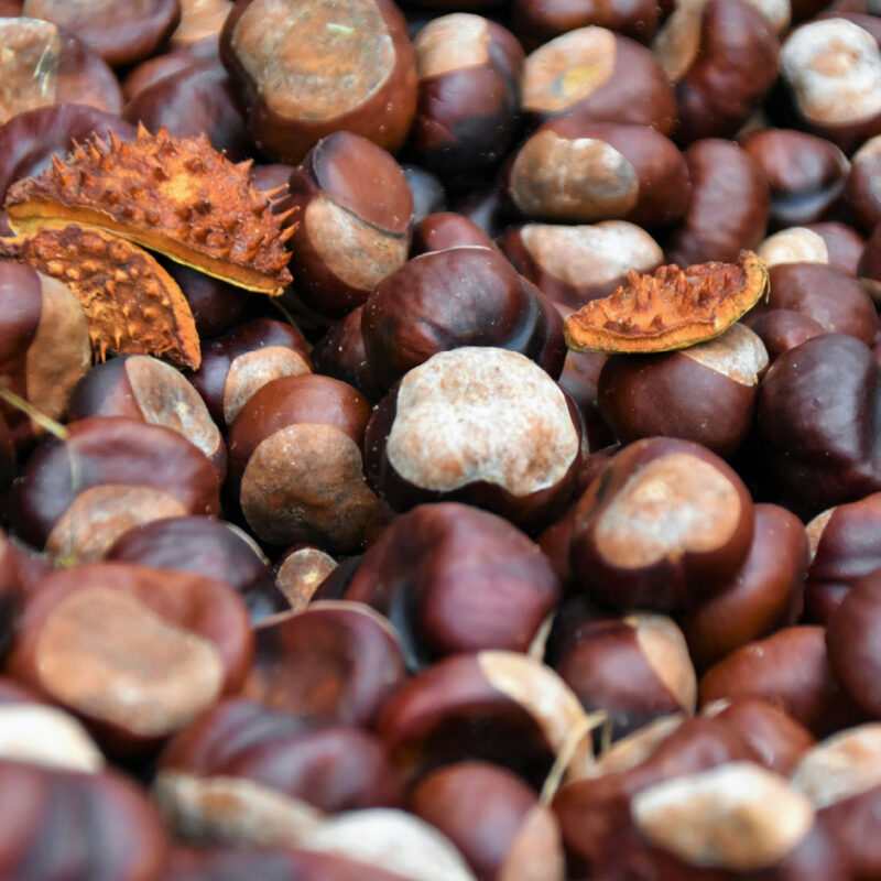
We met TACF during a transitional moment in their 40 year history. To date, their work was largely done through local chapters across the country, with supporters, volunteers, and scientists working quietly on the ground to bring the American chestnut tree back to life. As TACF prepared to make available the first blight-resistant tree in modern history, the organization realized the need to shift its focus by placing a greater emphasis on public awareness. If successful, they’d grow their donor base to support even more research and distribution of the tree, and inspire the next generation of supporters with the tree’s story of optimism and resilience.

As we learned more about the foundation that believed so intensely in the promise of bringing a blighted tree back to life–we saw the brand as a true reflection of its community. The manifestation of a passionate network of people bound by their love of the chestnut tree, a belief in the power of collaboration, and a dedication to becoming even better stewards of the natural world. TACF’s work is about the chestnut tree, sure–but really it’s about humans, all threatened species, and our future together on the planet.
Over the span of its four decades, the organization communicated through a relatively scientific lens, so we saw an opportunity to introduce more life, passion, emotion, and humanity to the brand. Looking to the future with TACF, we knew the path forward required building a more sophisticated and engaging brand, one that brought the chestnut’s incredible story to life and expressed the human impact of TACF’s work.
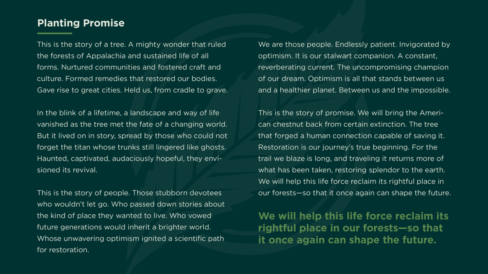
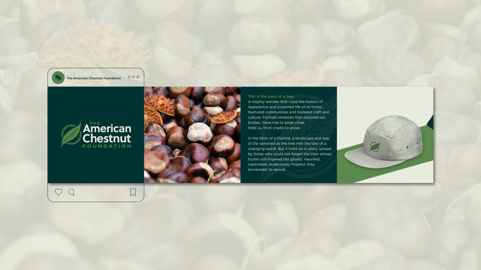
Optimism was the constant, energizing current that threaded through the new brand. We built a vibrant brand story about the majesty of this tree—in eastern forests and American culture alike—and the profound sense of loss people experienced in its absence. We emphasized hope over urgency and built an accessible and inviting narrative, demonstrating the importance and widespread impact of restoring the American chestnut.
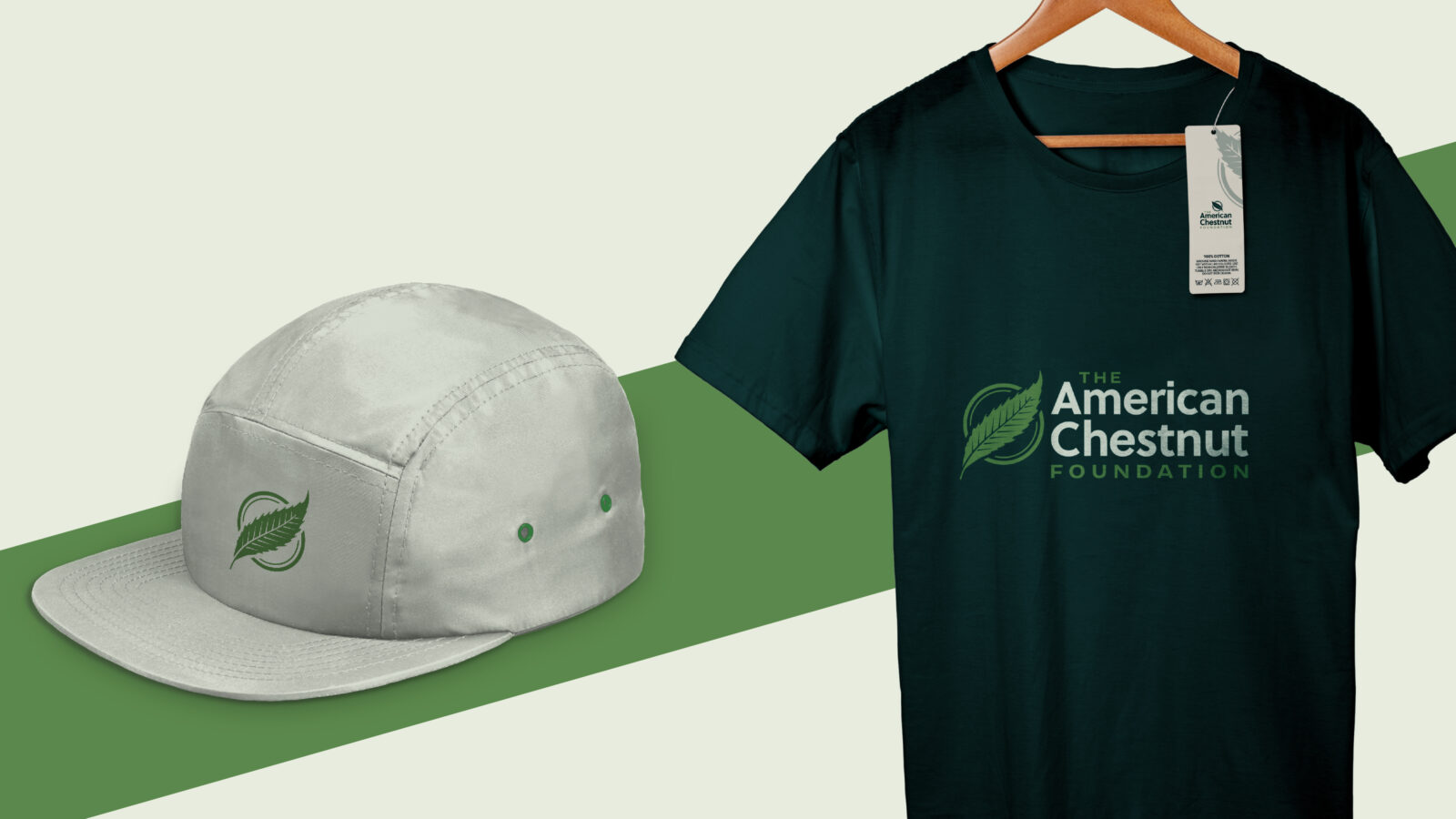
The TACF logo called for an evolution, not a revolution. We evolved its overall branding system for greater flexibility in its many applications and use cases, creating visuals that better represent the organization as it stands today while paying homage to its history.
A new set of brand guidelines with guidance on everything from approved colors, fonts, and logo applications, was developed and adopted not just by TACF HQ, but its chapters across the country.
After working closely with the TACF team and its board, we were proud to reveal a brand that reflected the organization’s reinvigorated mission and the passion of its supporters. This collaboration marked the first time that TACF had more than a logo, but a full and complete brand. It’s been a joy to watch TACF expand its reach with a stronger, more cohesive brand and compelling story that resonates in the hearts of those who work tirelessly to keep the American chestnut tree alive.
