Lore
Olympic Marketing Challenge
What is it about the Olympics that always seems to brew marketing and design controversy? Remember Izzy?……a mascot so odd his name was derived from “whatizit?” (although, Izzy was a better choice than runner-up Jimmy Nastics).
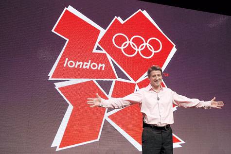
This time it’s the logo for the 2012 London Olympics, which was just released this week. The initial reaction has been brutal. The logo (in animated form) was said to provoke epileptic seizures and was pulled from the website. Some have compared it to a broken swastika or “some sort of comical sex act between ‘The Simpsons.'” A petition of 35,000 signatures was gathered to demand that it be replaced.
In response to an Olympic organizer’s statement that “it will grow on us,” one media response was “so does foot fungus.”
There’s no question that it’s impossible to nail a perfect “10” from the judges for an assignment like the Olympics logo. I can only imagine the design brief read something like…”the identity should be modern yet traditional, energetically calm, iconic in its flexibility while capturing the triumph of the human spirit.” In the end, the mark won’t be remembered any more than Izzy (he is still popular with some E-bay junkies, however). What will linger are people’s perceptions of the actual Olympic experience and its reflection on London/GB.