Lore
The High Stinky Cheese
In 2011, Moneyball introduced the concept of sabermetrics to the masses. Although baseball analytics had been around for decades in various forms, Bill James’s teachings (along with many other influencers before him) lit up the big screen as we watched Brad Pitt implement unappreciated metrics to build a squad of undervalued players. The Oakland A’s didn’t win the World Series, but the numbers-driven team surpassed all expectations, as they soared into the playoffs with an absurdly low cost-per-win (think: ROI – there is a marketing lesson in here, I promise!).
One of the most overhyped of these baseball metrics is Batting Average. Simply put, it’s the number of hits divided by the number of official at-bats (i.e. no walks, hits-by-pitch, or sacrifice hits). When a batter comes up to the plate, it’s the one statistic that will always be shown no matter what. It’s how fans usually perceive player value, and it can make the difference between batting lead-off and batting eighth in the lineup.
Let’s look at how Batting Average correlates to value. In this case, value means runs scored.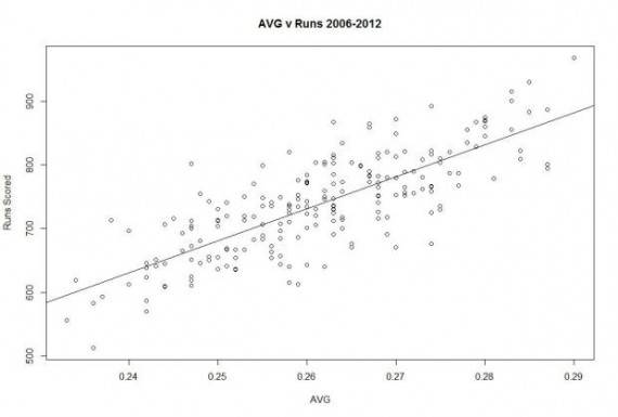
Okay, that’s nice. What does it mean?
That straight line represents our correlation – the closer all of our dots (data points) are to the line, the closer our X and Y axes are correlated. In this case it’s Batting Average versus Runs Scored from ’06 – ’12. This doesn’t tell us a whole lot without something to compare it to.
So what’s another metric to look at? Easy. On Base Percentage (OBP). This is all the times a batter gets on base divided by all of his at-bats. Said differently, it’s the percentage that the player does not make an out. Theoretically this is more tied to value (runs) because scoring is not discriminatory against how the batter got on base (both a walk and a single get a guy on first with no additional outs made, yet only OBP gives credit for both). Let’s graph it.
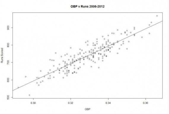
Aw yisss those dots are making some moves toward our correlation line. Using a metric that better encompassed what we considered to be value, we can be better judges of player contribution. BONUS: We can also make significantly better predictions, and thus decisions, knowing when two variables are strongly correlated.
Here comes the marketing lesson:
Visitor Count is the Batting Average of website analytics. It’s too relied-upon in its use of judging success and value.
Of course we all look at conversion and bounce and all that fun stuff, but give your visitors some value! If the people in your newsletter who signed up from a referral on ABC.com spend way more than those that came from XYZ.com, pull a Billy Beane and work as much ROI out of ABC as you can. It sounds obvious, but so often we marketers make the mistake of thinking of channels as a whole, or paid traffic as a whole. Don’t assume the superstars of the game (e.g. AdWords) are going to provide more value than the underdog (e.g. a partner blog post).
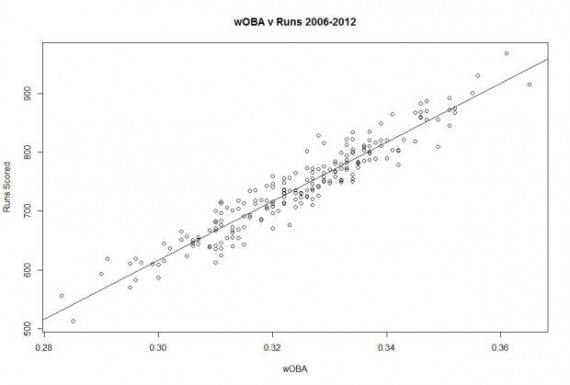
When we take our baseball example to the next step, and use a statistic that weights triples as more valuable than doubles, and so on, we get an even better correlation (think: putting values on Goals in Google Analytics).
Find the correlation in order to find the true value. To accomplish that, you might have to dig a little deeper.
Your players are not just their Batting Average.
Your visitors are not just their Conversion Rate.
Further reading:
Segmenting user acquisition in Google Analytics
Setting up goals in Google Analytics
Goal values in Google Analytics
Data pulled from baseball-reference.com.