Lore
New ESPN.com

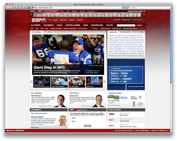
Last week ESPN launched the beta version of its redesigned website. The company said they were looking to reduce visual clutter and increase advertising options in an overall effort to boost revenue. In theory the simpler format would keep people on the site longer (and encourage them to dig deeper), and the increased advertising options would, well, increase advertising.
It seems like an improvement to me. The home page and navigation had always been info/link overload. They are paring down the 36 links in the block at the top of the page…to 19. It’s step in the right direction but it would be nice to see them go further. Best of all, they are killing the automatic playing video on the right column. It never featured content that I wanted, and I had to keep pausing it every time I reloaded the page. Video is best served up on demand…not by force. And they’re adding personalization tools to allow you to customize displays on the home page and more.
As for advertising….they will now give advertisers eight options for displaying messages on heavy traffic pages, up from three. Users, however, will be happy that they are eliminating the big banner ad that dominated the top of the home page.
All in all, a nice step forward. But still very busy. It’s a hard balance for a breaking news format. Now they need to work on increasing positive coverage for the Longhorns.