Lore
Gibbes Museum Website Launch Following Rebranding
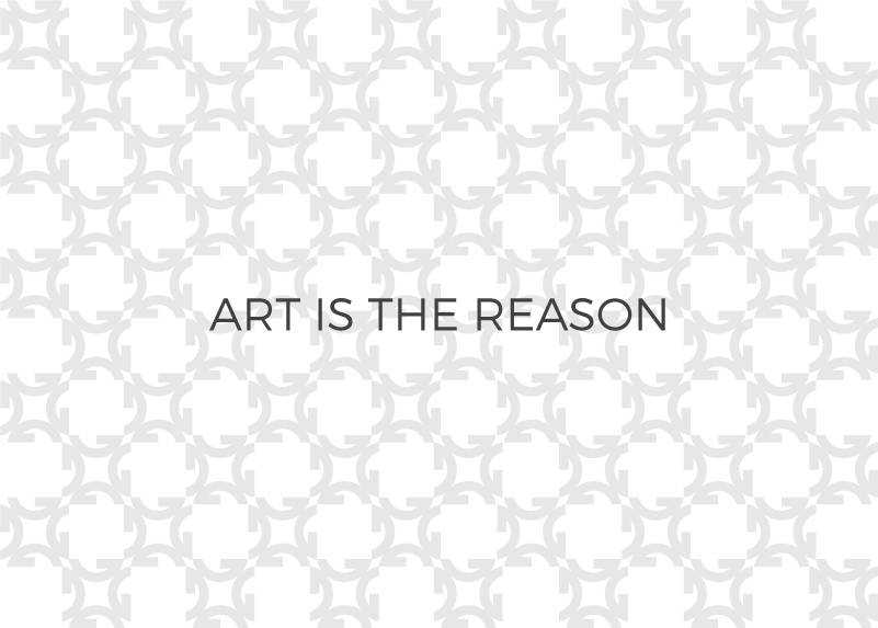
After an extensive strategic planning and rebranding process with our friends at Gil Shuler Graphic Design, we had our work cut out for us – create a new website for the Gibbes Museum that represented the new forward-thinking brand while giving the art its moment. After all, our tagline had become “Art is the Reason” and now was the time to see that come to life on screen.
This new site had to be as easy-to-use for a gradeschooler looking up summer camps as it was for a 30+ year member to see what events she could take her out-of-town guests to next month. These were real scenarios we had discussed during interviews with select “friends of the Gibbes” and needed to make as simple as possible.
Streamlining Content and Reorganizing
As with each major site build, we dug in to building a schematic with help from staff members, friends of the Gibbes Museum who we interviewed for their inputs on priorities and organization. After going round and round internally we had a presentable layout of the overall site structure that we felt focused on the user’s needs and wants, our specific audiences for each section of the site, and streamlined the former content.
With the site organization approved by multiple groups at the Gibbes Museum, it was time to start sketching out wireframes that would soon turn into page designs. Again, the user experience was at the forefront of our planning and we had to think through what users would want to get to from page A and how else they would find page B if not through page C…essentially going through a user flow analysis before a single page was created.
Digging into the former site’s analytics played a large role but we had to remember outliers like not having the luxury or a reorganization or even an “open” museum at the time due to the major renovation (to see what members were looking up in real time or in recent months) due to the major 18-month renovation.
Mobile Experience & Design Goals
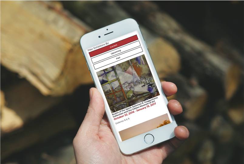
One thing was certain, we wanted the museum website to be mobile-first. We had to create an interface that was beautiful and just as clean on a handheld device as it would be displayed on a projection screen in a classroom.
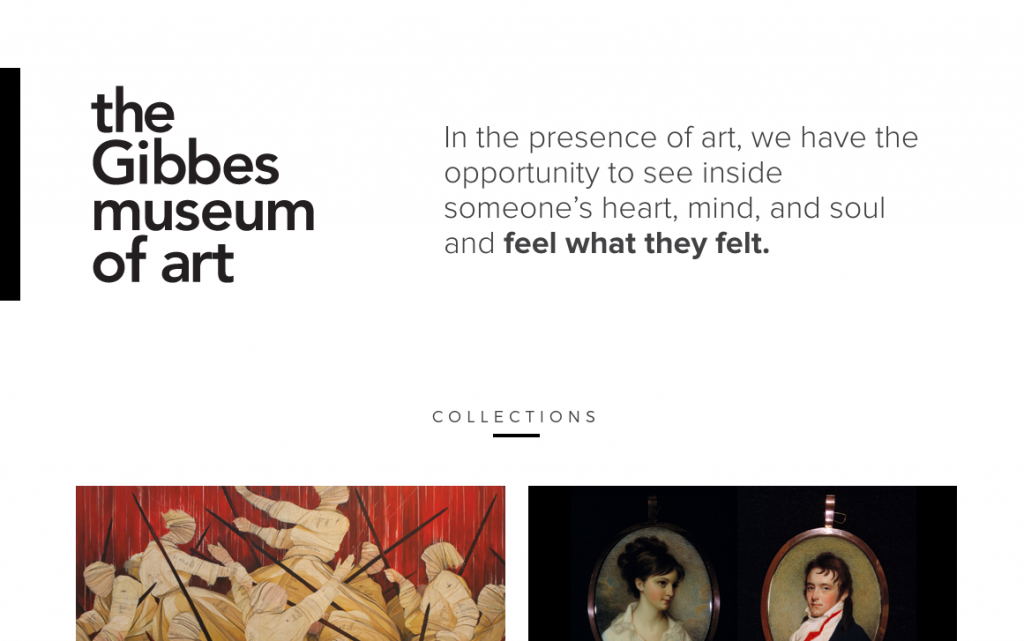
Nic says the idea behind the design was, “Let the design fall to the background to bring the art into focus. Just like a wall at an Art Gallery, let the art do the talking.“ This approach worked beautifully with the updated logo and brand identity and the rest fell easily into place. The team at the Gibbes Museum was on board at first sight.
Return of the Manifesto
One favorite feature are excerpts from the manifesto that appear at the top of main pages as a part of the header and refresh on page load to show a different excerpt. We’d never used a manifesto in this way before and decided this was the perfect time to tell the story behind the inspiration, influence, impact and decorative history of the museum itself. Jenny worked tirelessly on this manifesto and it was used as the kick starter to the rebranding process so it was rewarding to see the development process come full circle with its use (again).
Backend Tools
Multiple backend tools were custom built and modified to fit the needs of the robust team at the Gibbes including an admin that pushed events, exhibitions, and visiting artist content. With this tool the team could create events and exhibitions, spotlight certain ones, link all three page types to each other, categorize and specify audiences and pull in custom blog feeds, as needed.
We installed a blog that numerous Gibbes team members and their media firm Lou Hammond would contribute to. With a tagging system in place, the authors had the power to send certain posts to blog feeds on various pages throughout the site.
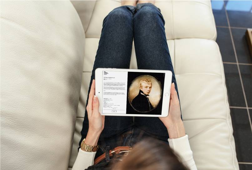
Perhaps the most impressive tool was one that can’t be seen by the user. Jason built a backend database that would take the PastPerfect database the Gibbes Museum had been contributing to for years and push in to the front end of the Miniatures Collection microsite. The Miniatures microsite was launched just 2 weeks after the full site and is primarily used on-site by museum visitors on an iPad inside the exhibition.
On Time and Just Right
Between tight deadlines, large group input, a hard launch date (due to the museum reopening!) and a beautiful new brand to live up to, this was a challenging project from start to finish and we couldn’t be more proud of our team and the dedication of the Gibbes team. It is a compliment to our collaborative work and perseverance to see the integrity of the site not only withheld, but continuing to get better and better as the Gibbes Museum adds new exhibitions and visiting artists, new stories and new (kick ass) events week after week.