Lore
DMO Mobile Site reboot
Blue Ion recently launched an improved mobile website for the Charleston Area CVB (teased on the blog back in January) and I thought I’d share a bit about the decision making process we used when deciding what to improve on an old mobile site with a limited budget.
Nowadays we build all of our clients’ websites using responsive design, but back when the CVB’s visitor site was created (5+ years ago, or 100+ internet years), responsive design was just a twinkle in the user experience world’s eye. The old mobile site was built with a different set of code, contains a shallower set of pages in the sitemap, and resides at an M.URL. Specifically, m.charlestoncvb.com. For this project we were in a bit of a bind because the CVB isn’t quite ready for a full site redesign complete with responsive code, but we also couldn’t afford to let the mobile site go untouched when it is receives 15% of our website traffic.
With a finite budget in hand, we decided to analyze the desktop website traffic to uncover areas that, if opened up to the mobile site, would provide the users with the most value. We also analyzed the current mobile UX to find areas of improvement. Here are some of the questions we set out to answer when doing our analysis:
- What sections of the desktop site get the most overall traffic, but don’t exist in the mobile site?
- What sections of the current desktop site get the most traffic from organic search?
- Are most mobile users at home in trip planning mode, or are they already here and on-the-go in Charleston?
- What parts of the current site are most outdated in look and feel, and hindering usability?
- What key website performance indicators (KPIs) could we drive more volume to with an improved mobile experience?
- What existing sections of the mobile site had little traffic and were cluttering the experience?
Here are the improvements we decided to make after the analysis was complete:
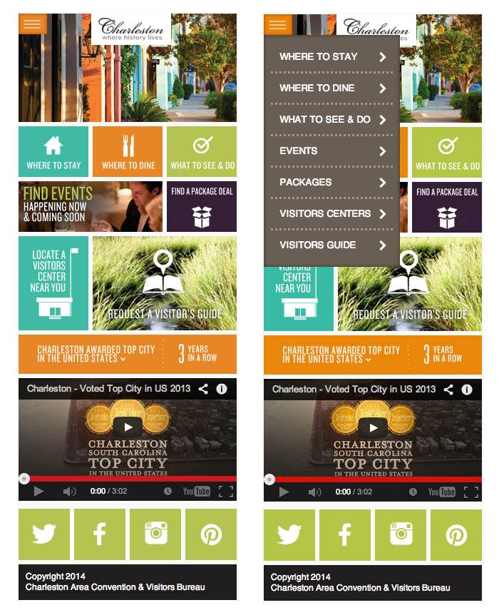
- Add the Events section of the website.
This was the #1 most viewed section of the desktop site not available to mobile users. It also serves the needs of any visitor in Charleston or planning a trip here that are looking for something to do. - Add the Packages section of the website.
It was the most viewed type of special offer on the CVB desktop site, and since 85% of our mobile site visitors are actually not in Charleston, we felt that they could still be interested in finding accommodations. - We added in a Request a Visitors Guide form.
This is a top KPI and wasn’t accessible previously via mobile. Ensuring trip planners can receive this brochure is vital to the CVB. It also allows us to open up some of our mobile search campaigns to push towards this goal. - Remove the 4 item footer navigation, which was outdated and limiting.
In its place, we added a top right “hamburger” navigation to allow for more direct navigation to key pages. - Remove the photo gallery
No one was using it, it added an unnecessary item to the navigation, and the licensed images in the gallery were outdated.
Here’s a screenshot of the new home page with and without the new navigation opened (including new site sections)
We hope you find the new site useful, whether you’re a potential Charleston visitor, or a permanent resident.