Lore
Screen Resolution Increasing
Mobile phones and tablets are gobbling up the traffic pie. Their diminutive screen resolutions are well accounted for with the use of responsive design.
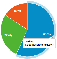
What about our old friend the computer though? How has the average screen resolution for laptops and desktops changed? What percent of the traffic pie do they make up?
I took a peek at a few clients’ traffic in the last 4 years, comparing the first 2 weeks of each year. One client was from the travel sector, another a real estate website, and third, our own website traffic, which is a decidedly techy audience profile.
Here’s what we found in common across all three website profiles:
- The 23″ monitor appears to have finally eclipsed the 19″ monitor in usage for desktops
- Similarly, the 15″ notebook has just passed the 13″ notebook as the most common source of laptop traffic
- Designing for huge monitors (the > 23″ variety) may be a waste of time, given that less than 1% of all traffic comes from this source. (designers gasp)
- Don’t ignore the small screens. Laptop traffic of the 10″-15″ variety is the majority of our website traffic in all accounts. Typically, these screens make up +60% of our non mobile traffic.
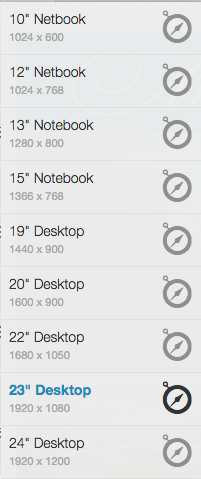
If you are building a website and want to test across multiple screen sizes for free, Screenfly is a helpful tool. It’s not perfect, particularly when you get into tap devices, but it is a great starting point. Their available screen resolutions for laptops and desktops are depicted to the left, but they also have many options for mobile devices and even TVs. You enter the URL you want to test and can then toggle your screen sizes as needed. Voila! You now can see your website on multiple device resolutions.