Lore
Chicago’s DIVVY Bike UX
Chicagooooo, my kind of town! I had the pleasure of visiting the Windy City last weekend. The trip was 3 pronged: see the family, see a friend get married, see the city. My wife and I had 1 full day in downtown with no commitments, so we had to spend it wisely in order to take care of the 3rd prong on the trident ‘o fun.
We decided to run (literally) from Ukrainian Village to the Loop to meet a friend for breakfast. The weather was perfect. I couldn’t stomach spending all day riding the El to get around town, but by foot was not an option to due to distances we needed to cover that day. At breakfast, my wife noticed some people riding some light blue bikes that said DIVVY on them. Once we noticed one, we noticed them all over the place. The lightbulb went on, and we knew our alternative to the train.
We rented 2 bikes for 24 hrs. $7 per bike per day, unlimited 30 minutes rides. It was an incredible day. It made me think of an article I had just read on the difference between user experience (UX) and user interface (UI). I thought I’d share my love of this entire user experience and further help clarify the difference between UX and UI for the uninitiated.
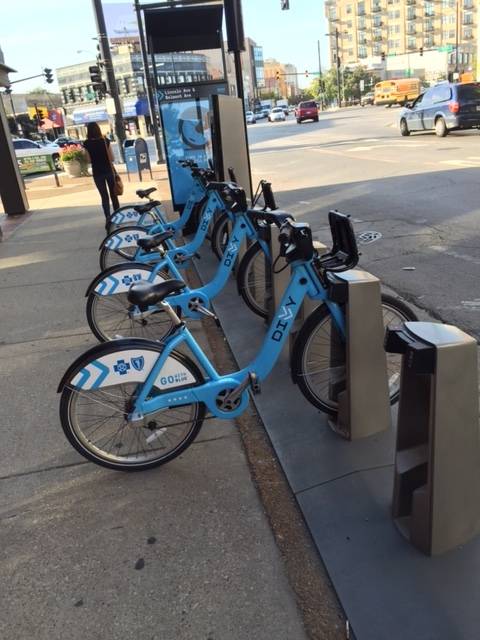 A DIVVY Bike Rack
After breakfast, we snatched up two bikes at a nearby stand. The DIVVY system is simple. You swipe a credit card. They issue a receipt with a ride code, or you can just view it on screen and remember it. You punch that number into each stand and your bike is unlocked.
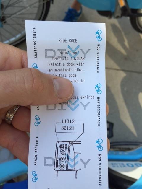 Receipt with ride code
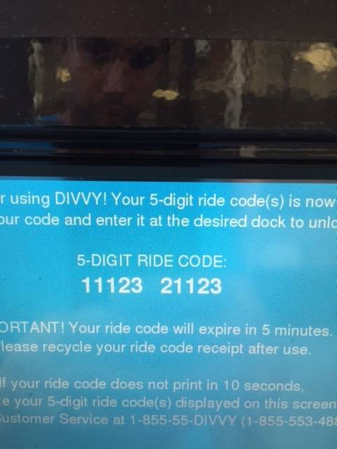 Code on the screen for 2 bikes
We rode from the Loop to a local pie shop (Hoosier Mama… yes, I know we had just eaten breakfast!). Then we rode back to our hotel, then the lake front, then to the northern neighborhoods for lunch and some shops, then a brewery, then back to the west side of town for dinner and beers. We just exchanged bikes whenever we got close to our destination. Here was our route.
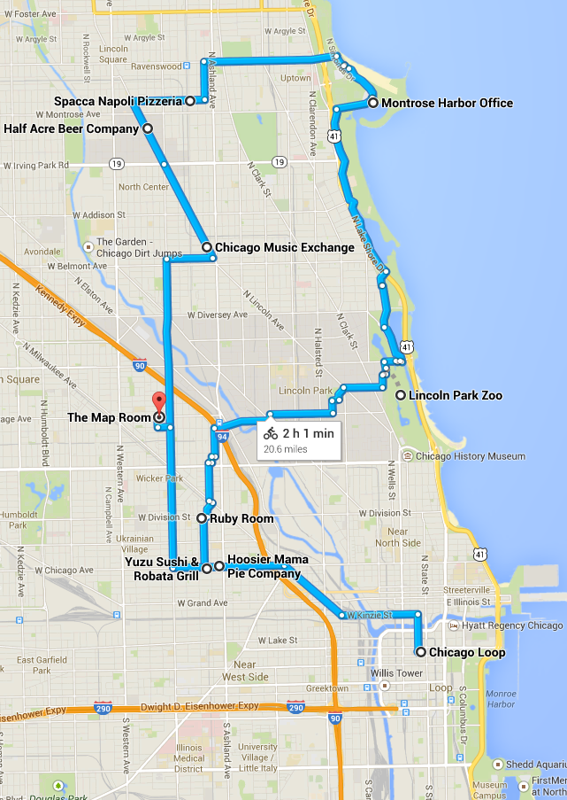 The route through the city
This was really easy because DIVVY made a very handy compass app to help find their bike stations. The app gives you the bikes available, distance to the nearest station, it’s cross street location, and a compass orienting you. It needed no explanation. You opened the app and just got it.  The DIVVY bike app screen… note I’m in Charleston now. Bikes were typically 200 yds away any time I used the app.
To tie this back to digital marketing (and keep this from being a family trip post entirely)… the experience helped define in a very practical sense, the difference between UX and UI. While the user interface (UI) on the station’s screen for bike rental was decent, the user experience (UX) for the entire process was excellent. The UX wasn’t just the screen’s interface, it was how many bikes were available at each station, how many stations exist throughout the city, how easily the bike unlocks/relocks at the station, the 30 minutes duration per ride, and the app’s usefulness in finding each station. The whole package, when put together, was incredibly satisfying.
This app has me thinking of all sorts of ways our friends at the Charleston CVB could help our visitors have a better experience in the city of Charleston. Simple mapping to a bevy of useful points of interest could be very nice to have, for example. Thanks to DIVVY and the Chicago Department of Transportation (CDOT) for this wonderful user experience.
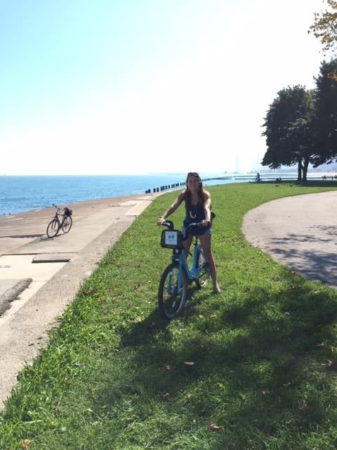 At the lake.